Build a centralized program management system for medical consultants to manage patient care programs in 7 SEA countries
Duration
2023-2024
Contribution
- Wireframing
- UX Design
- UI Library
Stakeholders
- Business owners
- Product manager
- Business analysts
- Developers
Context & purpose
Increase work productivity for consultants by 50%
.jpg)
Zuellig Pharma, an Asia's leading healthcare services provider, has partnered with pharmaceutical companies to create and implement Patient Support Programs (PSP), which aim to assist patients with chronic illnesses.
They have been doing all processes manually, tailored to each market in 7 SEA countries. However, this approach had its limitations. Therefore, the purpose of this portal is to improve program consultants' workflows in terms of daily work processing, managing, data storing and reporting by allowing ease in tracking and following up on the patient’s journey.
USERS & TASK FLOWs
We focused on program consultants as the main user
Program consultants, who are the main program administrators that manage the patient’s journey, was focused in phase 1. I mainly contributed to Patient enrolment & Patient actitivity modules.
.jpg)
Main contribution
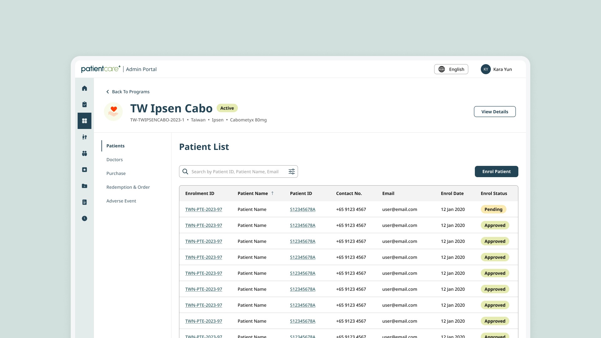
Patient enrolment feature
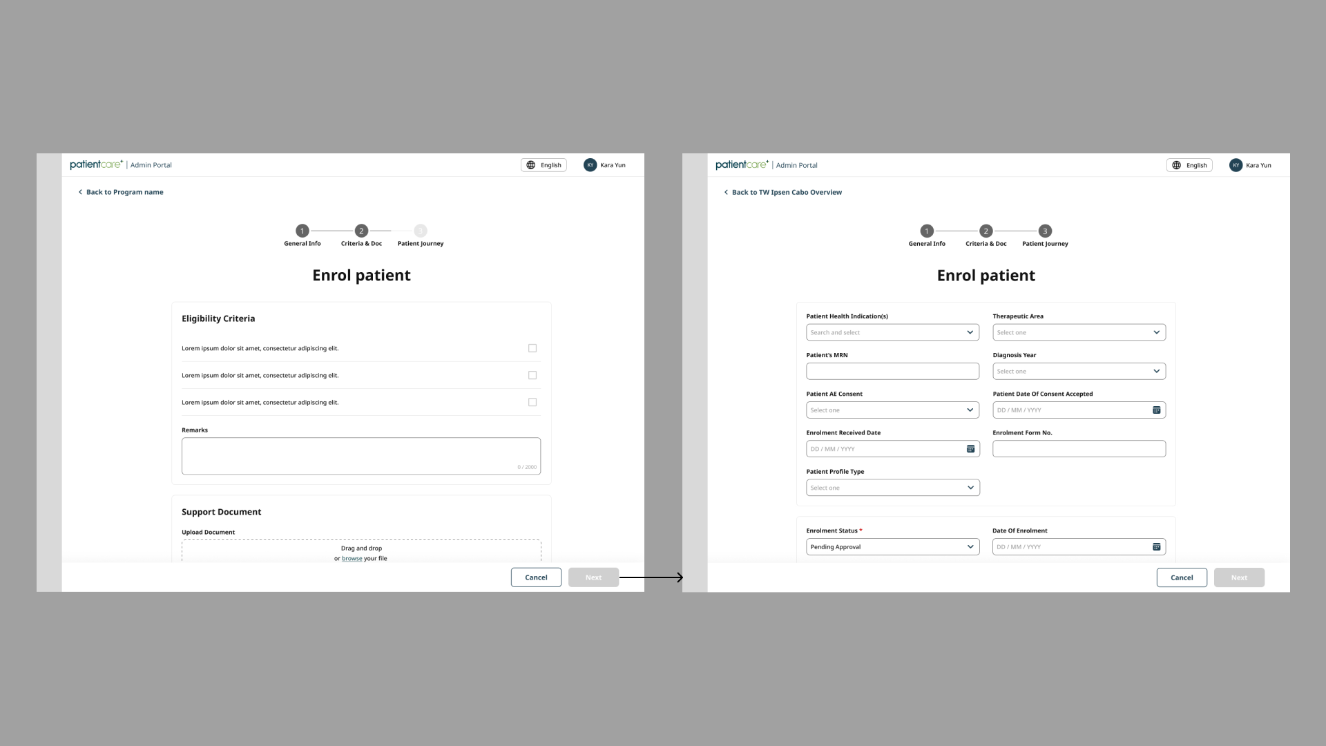
Having no input about user’ needs and pain points, I mapped out the main wireflow and brought it for discussion with biz owners and end users.
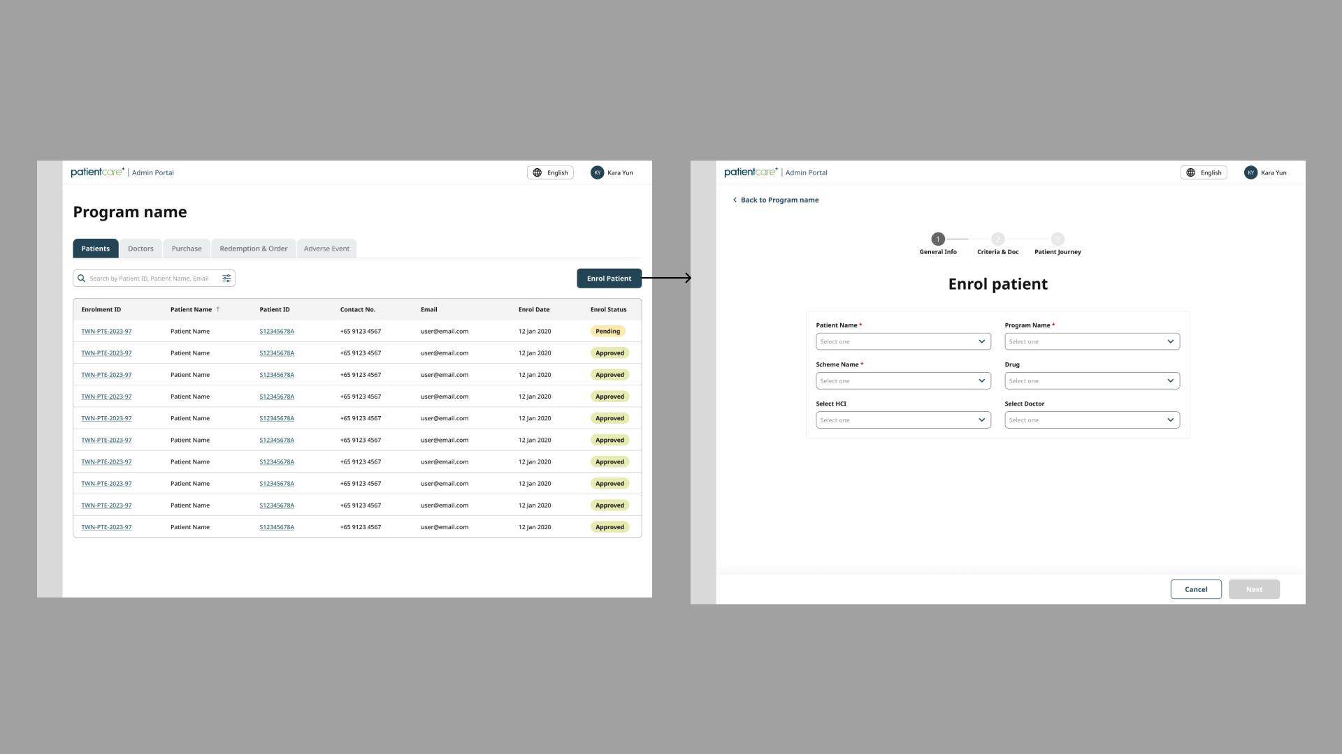
After discussion, I discovered an important insight:

Users have to rework because they aren't aware of their mistakes
Consultants sometimes enroll patients into incorrect programs, hospitals, or doctors. Having to oversee a large patient load, they miss these errors during the process, resulting in the need for rework at a later stage. While the design accurately represents the workflow, it doesn’t effectively tackle this pain point.
Solution: Assist in confirming data entries throughout the input process
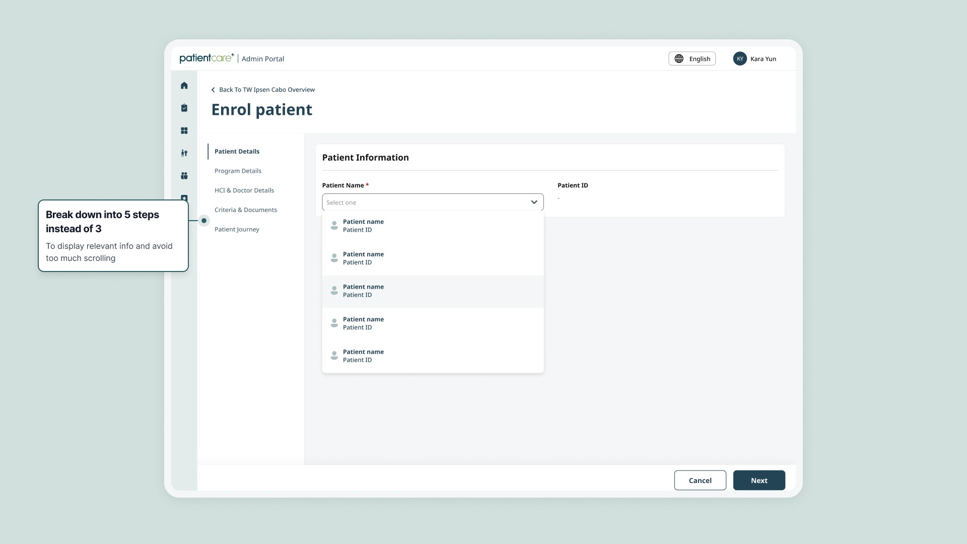
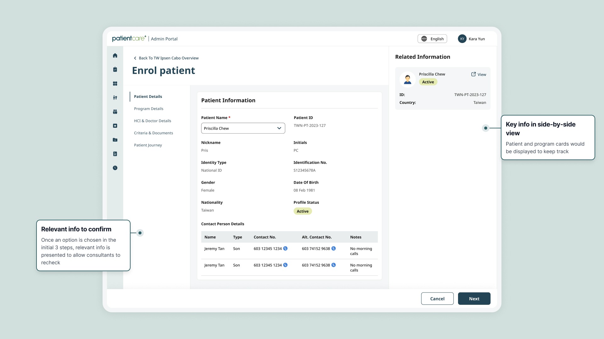
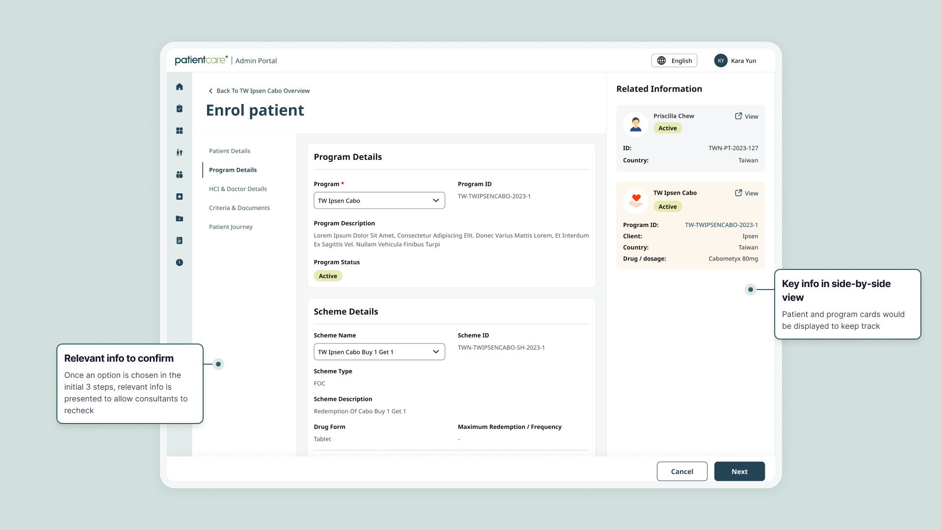
After finalization, this approach was applied to other patients’ activity mangament features.
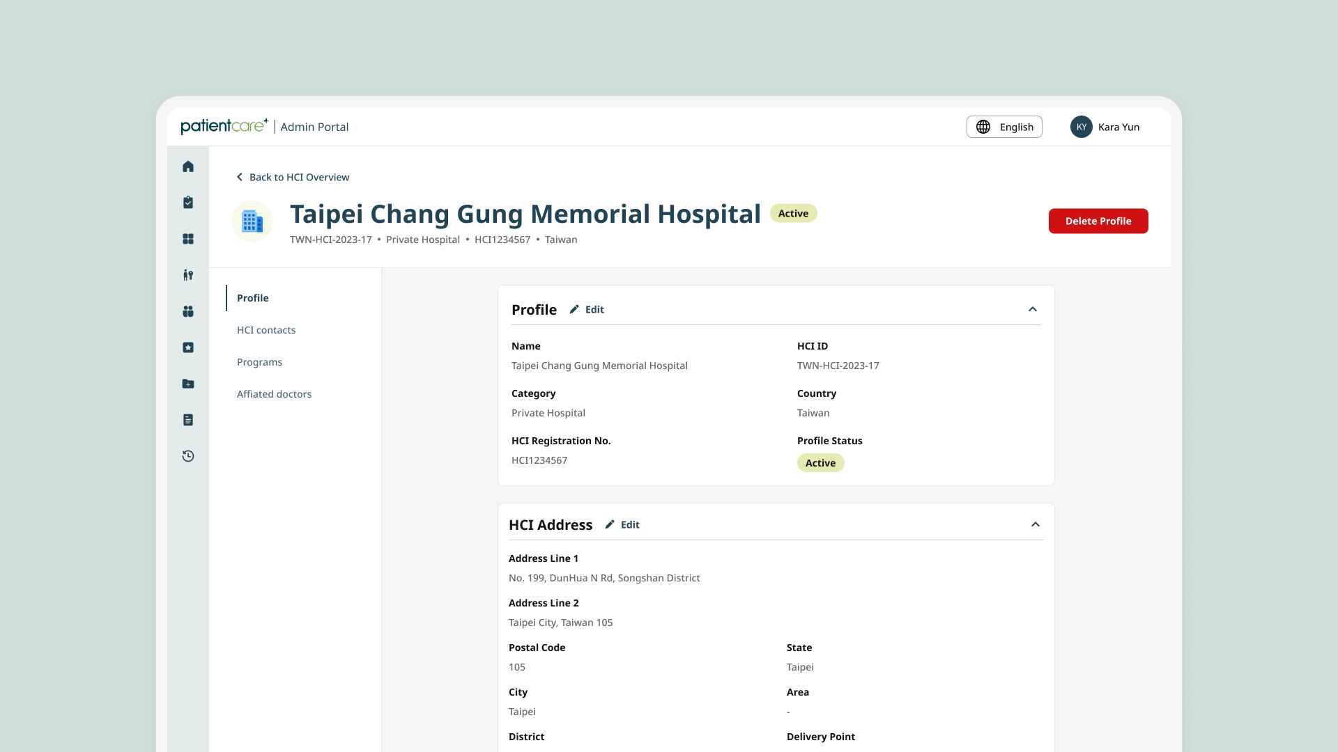
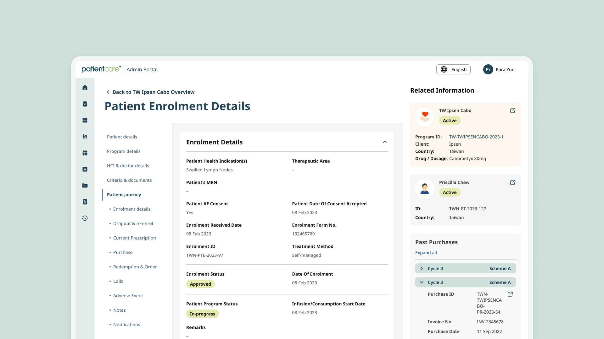
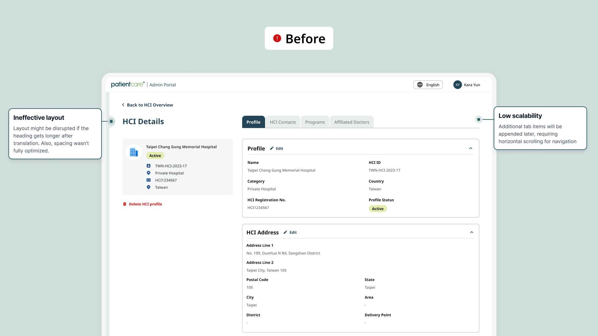
Main contribution
Redesigned templates for View & Edit modes
I joined the project when few screens for CRUD modes were in progress but received negative feedbacks. I helped revamped the UI after considering possible aspects for scalability.
I explored 2-column and 3-column layouts with few enhancements including:
Vertical tab to enhance scalability
Sub-tab to go to a specific section faster (for tabs > 3 sections)
Text layout: maximize space for dynamic content
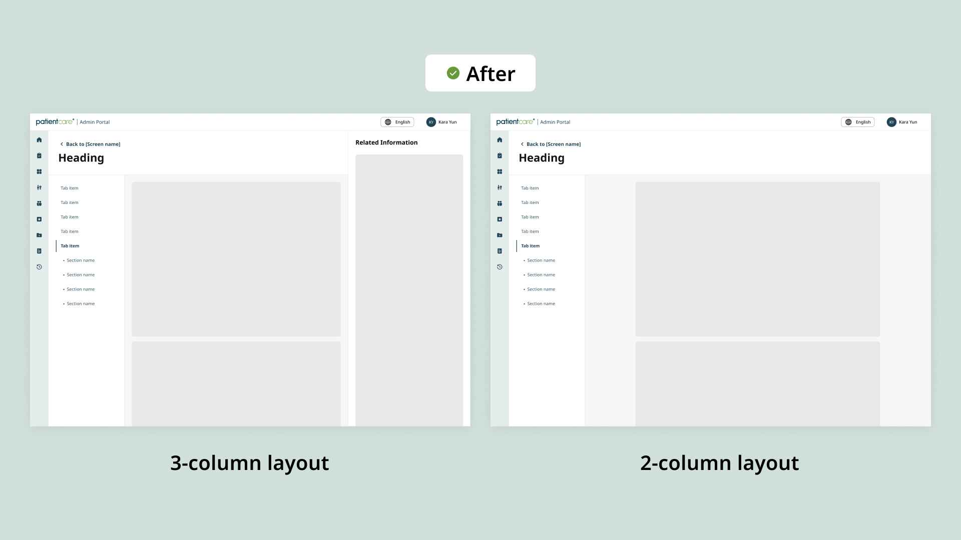
After finalization, the template was applied across View mode screens in other features.