Customer Care, a tool used for business trips management, is 1 of 9 internal tools that FPT Software needs to revamp this year. The new design saves an estimated 34% TOT for our customers.
Duration
3/2024 - Ongoing
Contribution
- UX Research
- Task flow
- Wireframing
- UI/UX Design
Stakeholders
- Business owners
- Project manager
- Lead designer
Approach
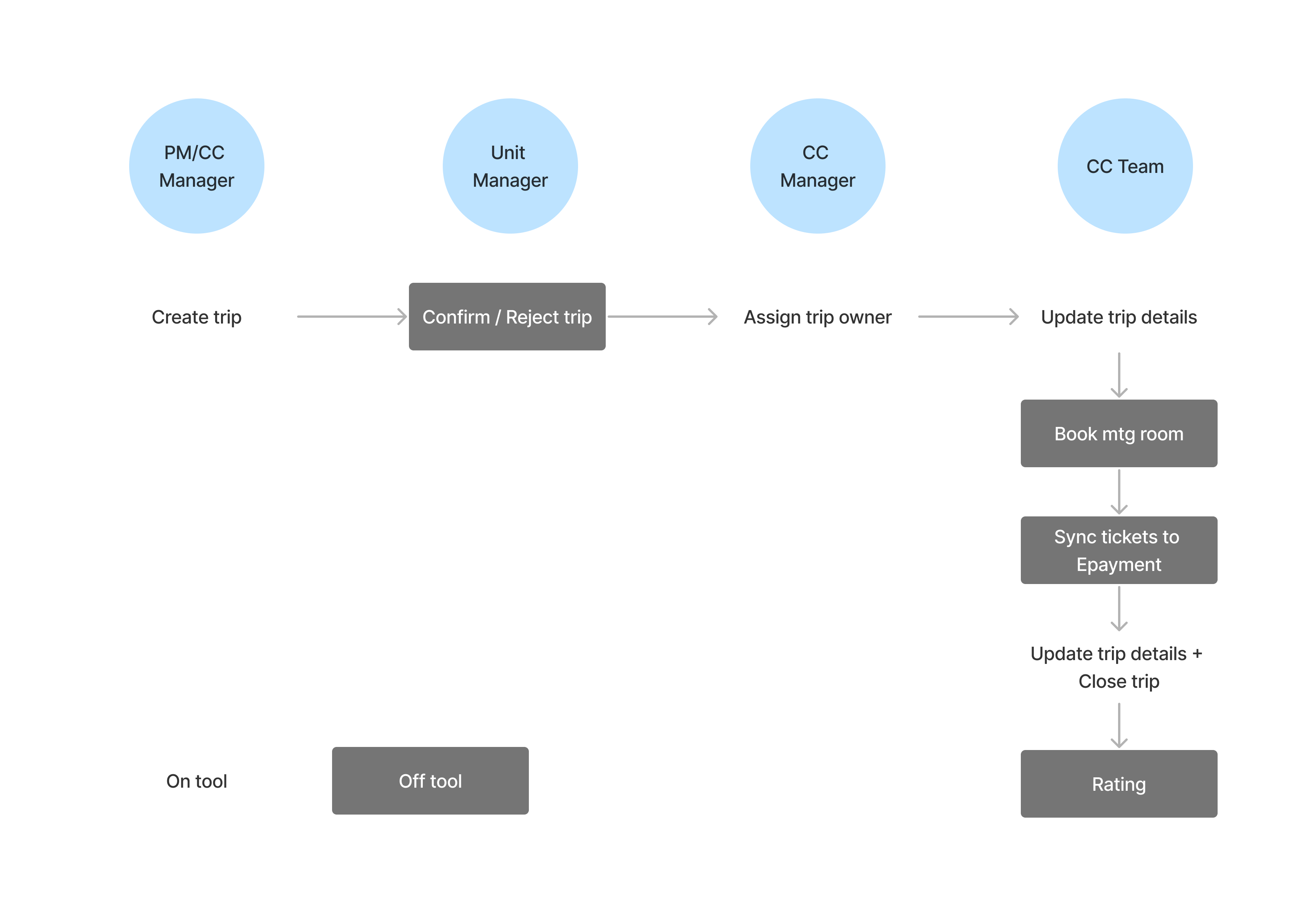
User flow
The tool is serving 5 user roles. In the scope of the project, we focused on CC Managers and CC Team roles first. I mapped out the main flow “Create a trip” after studying related docs.
Research methods
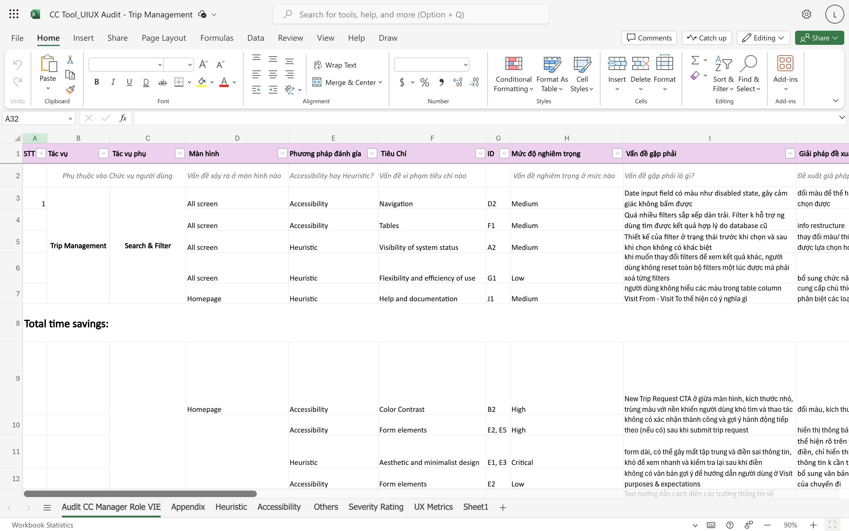
Heuristic evaluation
We noted down issues in current system and evaluated its severity levels using Nielsen's heuristics & WCAG criterias. I did Trip management and Report modules.
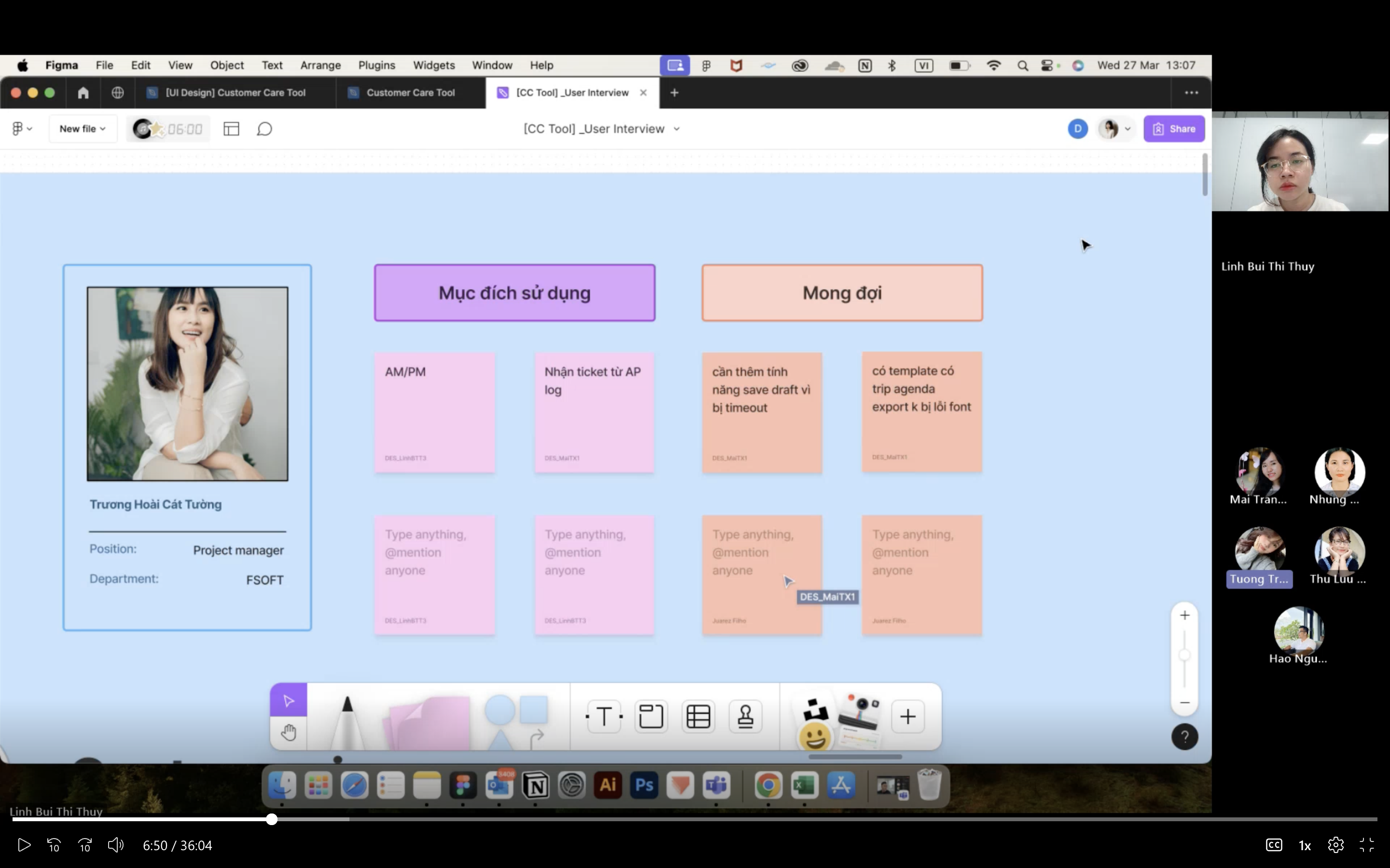
User interview
We interviewed 3 users to discover pain points and validate hypotheses from our audit report. I did interview planning and conducted 2 sessions.
FINDINGS
It is difficult to grasp overview and find info. Creating and editing trips are time-consuming and error-prone.

Forms are too long
Severe
Too much information is asked to create a trip request. The tool also asks users unnecessary questions during their journey.
Low level scan-ability
High
Filters look the same in different states, challenging users to detect which ones are used while searching information. Flat-organized layout makes it difficult to scan and update important info quickly.
Vague icons and jargons
Medium
Users find it time-consuming to refer to the written user guide to properly finish a task. They end up asking for manual support or do it wrongly.
Inconsistent design
Low
Components and behaviors while performing similar tasks lack consistency, making users less confident to make a decision.
Design goal
To improve productivity at work for our customers

Efficiency
Restructure hierarchy to make viewing and finding information on the Homepage more effective

Intuitiveness
Reduce unnecessary data and group info to reduce errors while creating trips and updating information

Convenience
Create mobile version and make experience seamless across platforms
Highlights
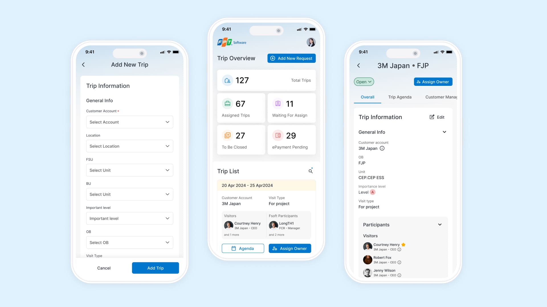
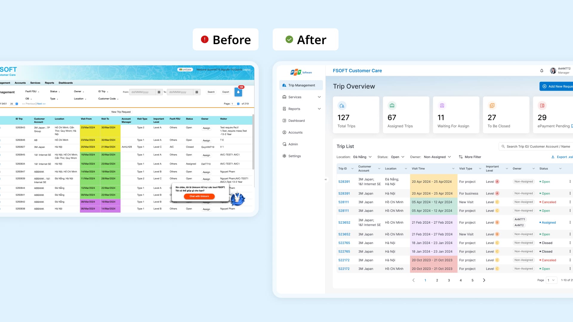
Homepage: Make viewing and finding information more effective
Display only commonly used filters
Highlight important data for a quick grasp
Display commonly viewed data and make table data content more visual pleasing
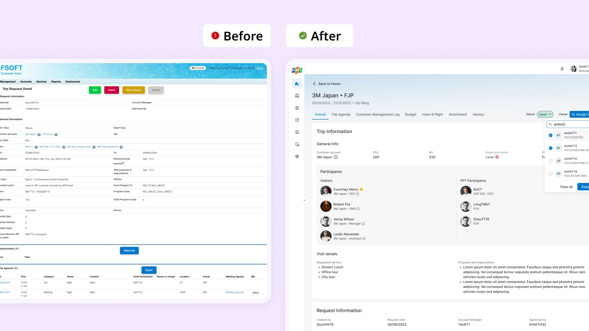
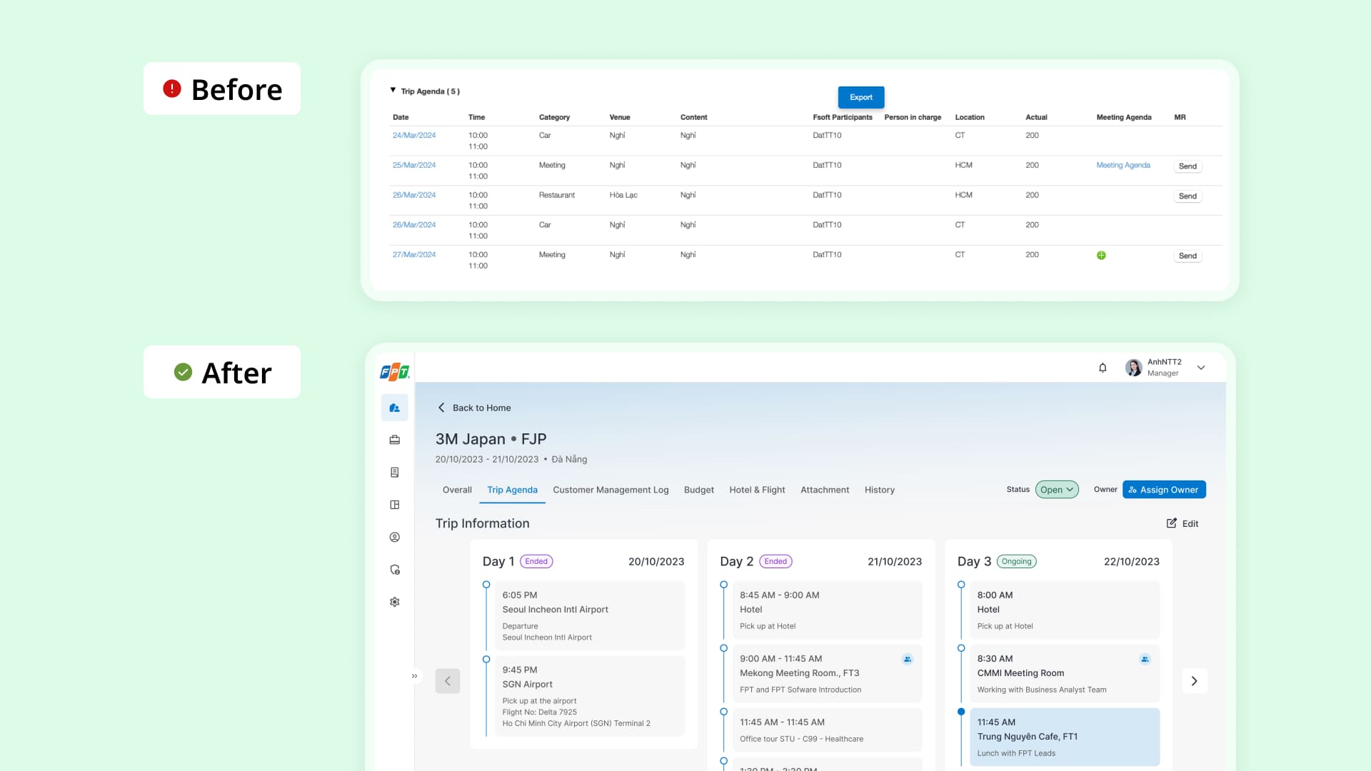
Trip details: View and edit trips faster
Get rid of unnecessary fields
Make frequent performed tasks easier to access
Restructure information
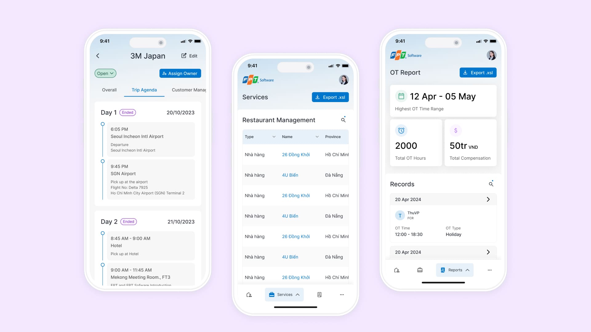
Trip agenda: View and edit intuitively with kanban board
Mobile app development
Seamless cross-platform experience